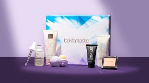
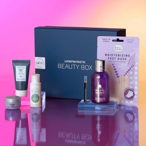
“Minimalism” is one of our favourite “M” words in the world of design and packaging. They say we shouldn’t judge a book by its cover; but in this world of countless options to choose from, we have no choice to but to set a products packaging as the deal breaker.
Minimalistic designs has been an ongoing trend and we see that more brands have been adopting it because of how people have been very receptive to this aesthetic trend. It is a design that works - its a clean, clear cut representation of a product and consumers at one glance see the brand and product.
In addition, we are In the age where visuals have superseded function and its all about which products make our vanity table fit for the ‘gram.
I pick out some of my favourite brands where I rate their packaging 10 out of 10.
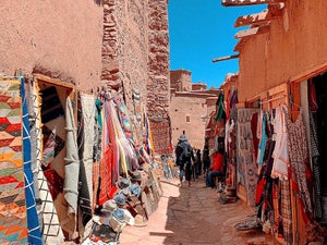
Huxley
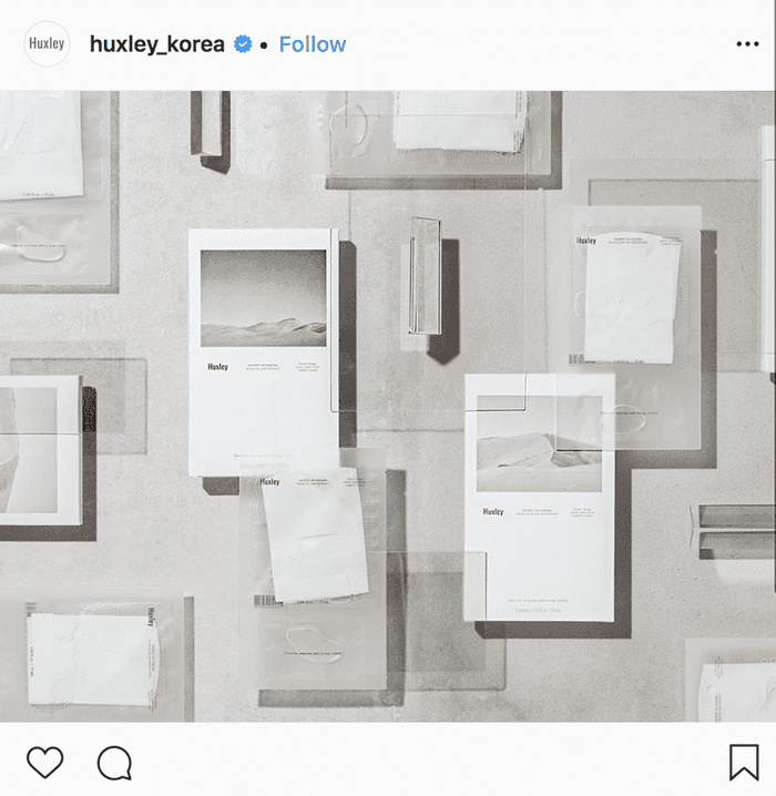
This cult Korean beauty brand took the beauty world by storm when it first launched.
Inspired by the secrets of the Saharan Desert, Huxley products are based off the prickly pear extract that the women of Morocco used to replenish their
skin’s moisture. It is a brand developed for the contemporary consumers of today - the cactus seeds of the desert are extracted into oils which has the effect of fighting the negative effects of fine dust in the city. The brand’s packaging also showcases its mission to deliver simple yet effective products with unique value that accentuate true beauty.
The Lotus
The Lotus Jeju is a brand inspired from the lotus garden of the thousand year old Beophwasa temple on Jeju island. The brand encapsulates the beauty of the lotus flower in its packaging, as well as the calmness the flower and leaves is supposed to bring to your skin.
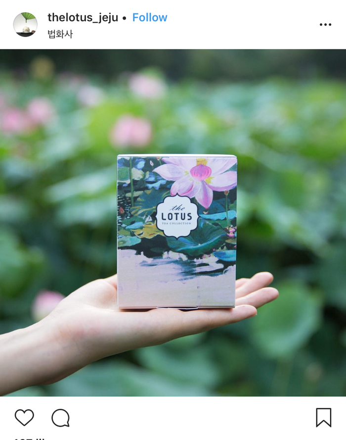
Its products will bring the “whispers” of the lotus flower, sunshine, wind and water of Jeju to your skin and regain its calmness from the amazing properties of the lotus leaves.
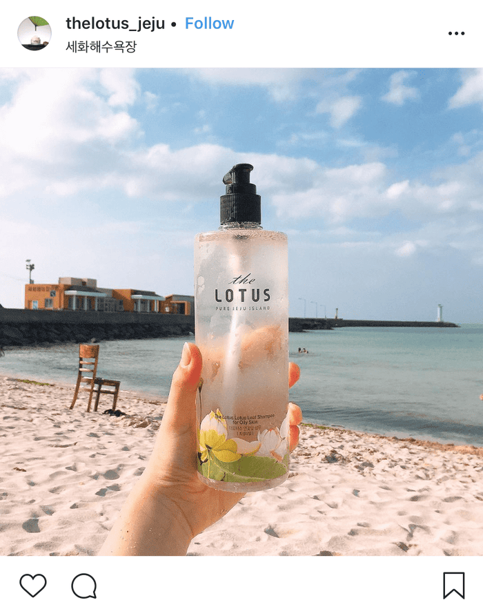
Source: The Lotus
Gallinée
Gallinée created by Marie Drago, a French Doctor in Pharmacy and a member of the French Society of Cosmetic Science.
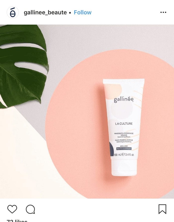
The brand is made for sensitive skin, taking care of microbiome (all good bacteria and microorganisms that live in harmony on and in our body) and bringing back the skin back to its optimal health.
The brand elements are a little more “complicating”, but meaningful and designed with a colour palette appealing to the Millennials of today. Coupled with the Navy, Powder Pink, Pastel Yellow and Grey palette, the graphic elements of molecule structures are paralleled in all of their products.
NIOD
NIOD stands for Non Invasive Options in Dermatology. It is the luxe and more complicated sister to The Ordinary. It is also focused on experimental, new-gen technology and pushing the limits of skincare science.
The brand focuses on earthy and simplistic design that is functional and aligns with the characteristic that its products posses.
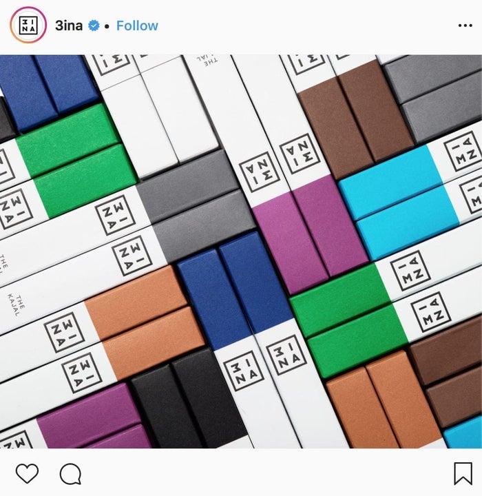
3INA

A cruelty free and vegan cult makeup makeup brand, it is the brainchild of Pablo Rivera and Mark Eve and first launched in February 2016. It has more than 450 products under its wing, with a variety of affordable makeup suitable for all skin tones.
The brand was said to be born to disrupt and its brand colours of black and white is the perfect base to the multitude of colours its makeup brings.
The brand identity is comes off strong in its packaging - the black and white and shouts out clearly its “powerful” and “disruptive” messaging where the colours juxtaposed shows “playful” and “fearless”.
Related Articles